Key Design Elements for a Construction Fence Banner
 29 September 2020
 3 mins read
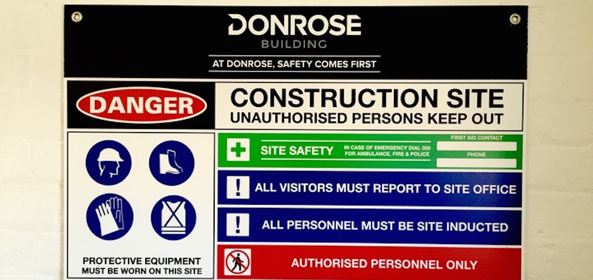
Get the most out of your printed banner mesh by making sure all the key design elements are executed correctly. Ultimately it comes down to three key features to having a successful construction fence banner; Text, Font and Colour. All of which play an equally important role in making sure your banner is a triumph.
Text
Starting off with the most obvious design element, the text. There are many factors that apply when it comes to the text, such as the size and the content. The size you obviously want to be large when it comes to the company logo or slogan so that it will be the element most clearly visible and therefore easily read. The most common content being shared are things like; contact information, company website and social media(s) all of which are important in their own way. All three go together to make sure those who see your banner know how they can get in contact, where they can look to find out more about your company and see what your company is up to or has been up to through your socials.
Font
Choosing a font is a very crucial element of a construction fence banner - simply put, the font you decide on can either be your banner’s success or failure. Most professional suppliers will happily advise you on what would work best for your company. A clear and concise, easy to read font is what you’re after, therefore it's easily readable, be it at a distance or while driving past at speed.
It is also important to remember that branding in this instance is an important factor to consider. If your company follows a certain style guide when it comes to font and design then its best to stick to those guidelines to get the best results from the banner.
Colour
Colour is the initial part of a banner that draws the attention of passersby, making it a very important factor in the success of your construction fence banner. Selecting the appropriate colours can be difficult but most of the time a company already has colours chosen for its brand image, and it's best to stay with these colours due to familiarity and consistency. Choose colours that contrast each other or even colours that contrast the surrounding environment allowing them to really stand out that bit more. Choose bold colours that are both easy to read from the distance and up-close, it’ll help your banner to pop and potentially give your company the competitive edge from a visual standpoint.
Hopefully, it's now clear how text, font and colour all come together with their uniquely specific attributes to create a successful banner. All three are just as important as each other and without just one design element your banner would be struggling to gain the public's attention in the way it should. Utilising these three elements effectively will without a doubt get the most out of your mesh banner.


