Back to Basics: Safety Signage
 28 May 2021
 4 mins read
Safety signage might seem unglamorous and a little dull, something to be tacked on to the end of your branding project or rushed at the last minute. However, this could spell the end of your project, or worse, lead to human disaster. Safety signage is required by law, and several regulations dictate how, what, where and when it should be displayed. Failing to follow these regulations could see your business shut down!
What's more, safety signage is crucial to the well-being of your staff and customers. It tells them which locations are or are not safe, where to go in case of an emergency, and what behaviours they can adopt to limit their danger. As such, safety signage should be seamlessly, and very obviously, integrated into your design scheme, whether you're creating signage for an office space or a construction site. From beginning to end, your safety signage needs to be coherent, fool-proof and crystal clear.
Sign Language
Signs are first and foremost a method of visual communication. Their main point should be understood in a single glance, with little need for interpretation or reflection. This is especially important for safety signs, which use widely known and accessible visual cues to get their point across.
While there are numerous different types of safety signage out there, all of their objectives are highly specific. They therefore require certain guiding principles to be kept in mind. It's essential to know some of the broader categories and goals of safety signs before you start hanging them up!
On Target
Safety signage has a variety of functions. However, it can be divided into a few broad categories:
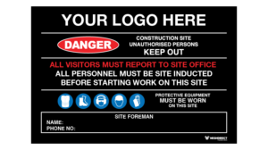
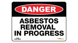
Warning workers of possible risks and how to avoid them
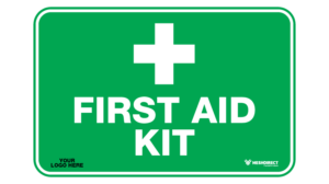
Directing workers to emergency equipment
Directing workers to safety in an emergency
Familiarising workers with security and limited access policies
The design and location of signs will depend on which of these goals they're working towards.

Pictures Speak a Thousand Words
The vast majority of safety signs don't really bother with words. Words take longer for our brains to process and they're language-dependent, whereas images are almost universal. This means your safety signs speak to everyone, no matter their language proficiency, reading comprehension or word-processing abilities. Universally understood pictographs are therefore the crux of effective safety signage.
Colour Coding
One of the key ways in which safety signs communicate with their audience is through colour. Each colour expresses a universally recognised message that can be understood in the blink of an eye.
Danger: red, white or black
Caution: yellow letters or pictographs on a black panel with a yellow background
Mandatory instruction: white letters or pictographs on a blue background
Safety instruction: green letters or pictographs on a green panel with a white background

A Word for Every Risk Level
The wording on your safety signs should match the level of risk involved. While 'danger' is the word most often associated with safety signage, only particular circumstances warrant this type of language. Risk exists along a spectrum, and the language on your signs should be scaled at the appropriate level.
Here are some general guidelines:
Notice: physical injury is not a credible risk
Caution: physical injury is possible, but not serious injury or death
Warning: serious injury or death is possible
Danger: serious injury or death is almost certain if the hazardous event occurs

The Last Word...
Ultimately, safety signs are there for you, your staff and your customers. They are an integral element in your signage and shouldn't be left till the last minute.
If this is all a little stressful, don't worry! At Mesh Direct, we've got your back. Check out our range of Safety Signage, and check-in with one of our consultants to make sure your signage is working for you!


