Eight Design Tips for Signs that Sell
 30 April 2021
 6 mins read
We live in a digital world. However, good old fashioned signage is still one of the best ways to reach a large audience and boost brand visibility. Whether it's a billboard or a banner, indoors or outdoors, signs are a central element in your visitors' experiences. Creating a sign that sells is easy if you follow these simple design tips.
Signage helps you develop your brand aesthetics and become recognisable in the public eye. It informs your visitors' decision to return - or not. Most importantly, though, good signage ensures that your business attracts public attention, then creates a navigable and intuitive experience for this public when they come to you.
Effective signage can consequently be a great boon to your business. It's an integral aspect of your marketing strategy and acts as a silent salesperson who never needs to take a break. On the other hand, bad signage is actively detrimental to your success. It alienates potential customers before they even set foot inside, and can create confusion about your target market, product or service, and brand identity.
We've seen a lot of great signage in our time - and some not-so-great signs. To help you navigate the sometimes tricky world of marketing design, we've pooled our expertise into eight simple design tips. Whether you're a small, privately-owned business or a large corporation, the principles of effective signage remain the same, and knowing them will empower you to market to your strengths.
Eight Design Principles for Effective Signage
Location, Location, Location
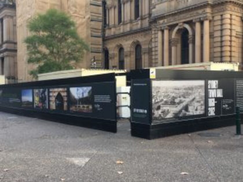
Street signs, billboards or window displays all perform very different roles, in different locations. Keeping in mind the specific function of a street sign versus a window display, for example, will help you come up with an appropriate design tailored to place and purpose.
Where a street sign or a billboard need to provide critical informational data in clear and concise ways, window displays are designed to entice and intrigue passers-by into your store. Attractive graphics and catchy text are, therefore, more appropriate here. The point being, your design priorities will be very different either way!
It's also essential to think about your sign's surroundings. Whether it'll be hung on a brick wall or against a sea of greenery, against a modern concrete backdrop or a scenic landscape, it needs to stand out without jarring. Signs should complement their environment while nonetheless remaining attention-grabbing and easily legible.
Short and Sweet
Remember to keep things easy for your audience. 'Less is more' might be a bit of a tired phrase, but it stands true to this day. Short and concise text in an appropriately sized and shaped sign means your message will be legible, no matter the distance.
If they're faced with too much information, audiences are less likely to finish reading. Seven words or less is the accepted wisdom regarding signs that will be read from a distance. However, if you're displaying a menu or list, or providing specific information, just remember to keep things as simple and straightforward as possible. A good rule of thumb is the rule of five: if it takes more than five seconds to interpret your sign, it's too long.
Avoid Over-crowding
Along with a short and sweet message, your design elements should also veer towards the minimal. Over-crowded signs are challenging to read and understand, as well as just being off-putting. Crowding is not a great aesthetic choice!
While it may be tempting to fill any empty spots with text or designs, remember that negative space is your friend. Negative space refers to those areas that are left bare of graphics, helping your existing design elements breathe and stand out. As a general rule for optimum readability, thirty or forty percent of your sign should consist of negative space.
What's Your Type?
Fonts come in all shapes and sizes. Use this wide variety of styles to your advantage when choosing the one that's right for you. However, don't sacrifice function to aesthetics. Even if a font feels or looks better, being able to read it is more important.
Different fonts and weights lend themselves to being read up close or from a distance. Sans-serif styles, for example, are easier to read if there is little text or you're reading from far away. In a larger body of text, serif styles help delineate words and letters.
Be sure to use both upper and lower-case letters. This helps the human brain to understand the structure of your message and make visual sense of it.
As a general rule, stick to fewer than three different typefaces. All the fonts should complement each other and be easy to read, resulting in a cohesive and legible branding investment.
Looks Do Matter
The strategic use of logos, artwork, photos and other graphic elements really helps make your signs visually captivating. It draws the eye, catching passer-by attention, and creates a sense of dynamism and energy. Furthermore, logos and colour schemes are like your signature: the public will recognise your brand quickly and associate specific words or feelings with you. In fact, studies suggest that eighty percent of trademark recognition by the public is due to colours! A well-designed logo and colour scheme used across your signage campaign truly creates cohesion, a consistent identity, and customer loyalty.
Opposites Attract
The best way to ensure your signs are legible is through contrasting colours. Opposing the foreground to the background helps essential elements stand out, and it guarantees an effortless reading experience for audiences. Combinations of dark and light colours are your safest bet in this arena. On the other hand, pairing similar colours can result in a sign that feels, and looks, fuzzy or ill-defined.
Another simple design tip is that the true art lies in choosing contrasting colours that nonetheless complement each other. Colours that clash too aggressively tend to be unpleasant to look at and alienate readers.
Hierarchy is Key
The layout of your sign should clearly demonstrate where the crucial information is. Through font, design and spatial arrangement, make sure you communicate the order in which information should be read, and which information your audiences should retain.
Ask the Experts!
Don't leave your signage up to chance! Here at Mesh Direct, we've got decades of experience in signage design. We're more than happy to help! Feel free to reach out with any questions, or if you'd like to get a quote. If you would like to find out more about the projects we have worked on, have a look here.